Bros With Hoes
Branding ProjectThis branding project was for a youthful and edgy plant nursery that needed a facelift. Their old branding didn't quite fit the bold yet earthy feel they were going for.
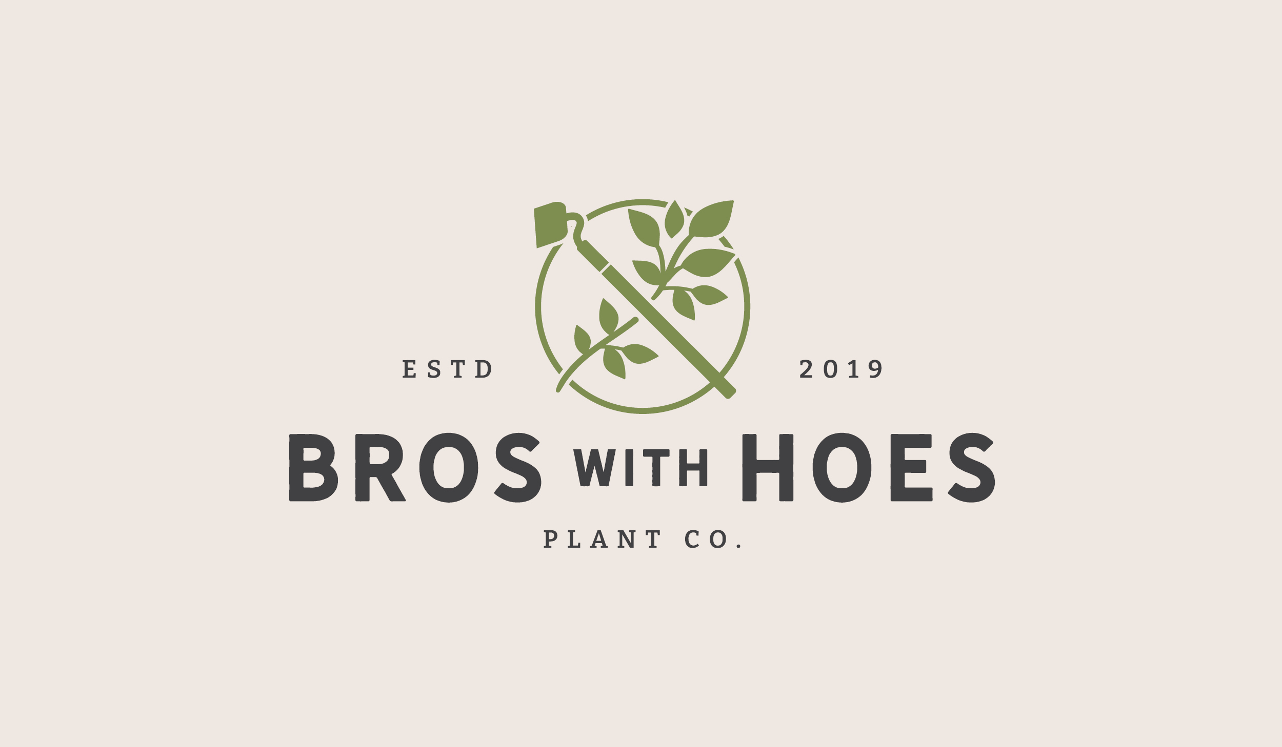
The client didn't want to depart entirely from the original imagery of the gardening hoe + leaf emblem, so the refreshed version includes that same concept but with a bolder and more organic feel.
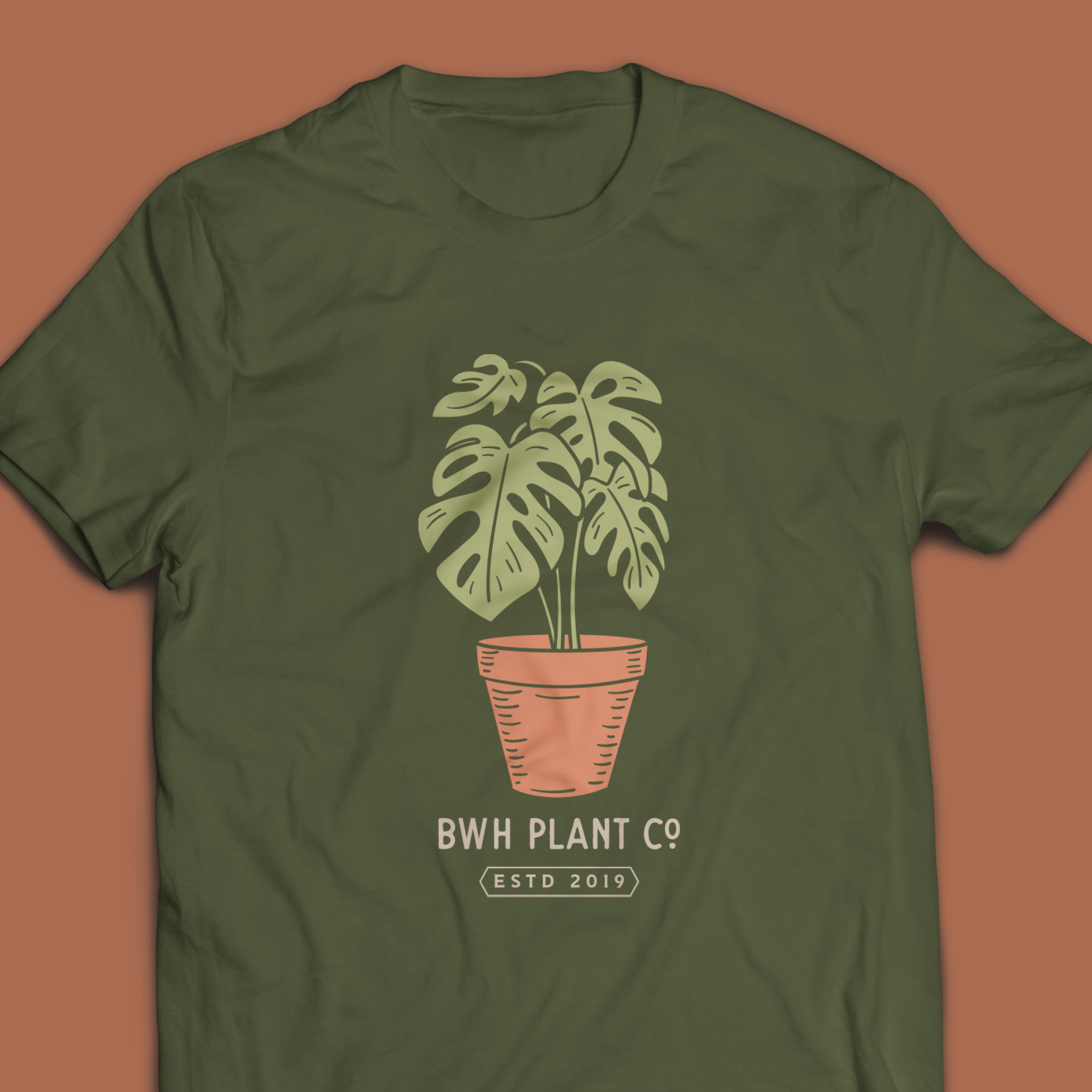
The typography is simple and walks the line between modern and vintage - creating a nice structure for the many and fun apparel designs and sub-brands that fall under Bros With Hoes.
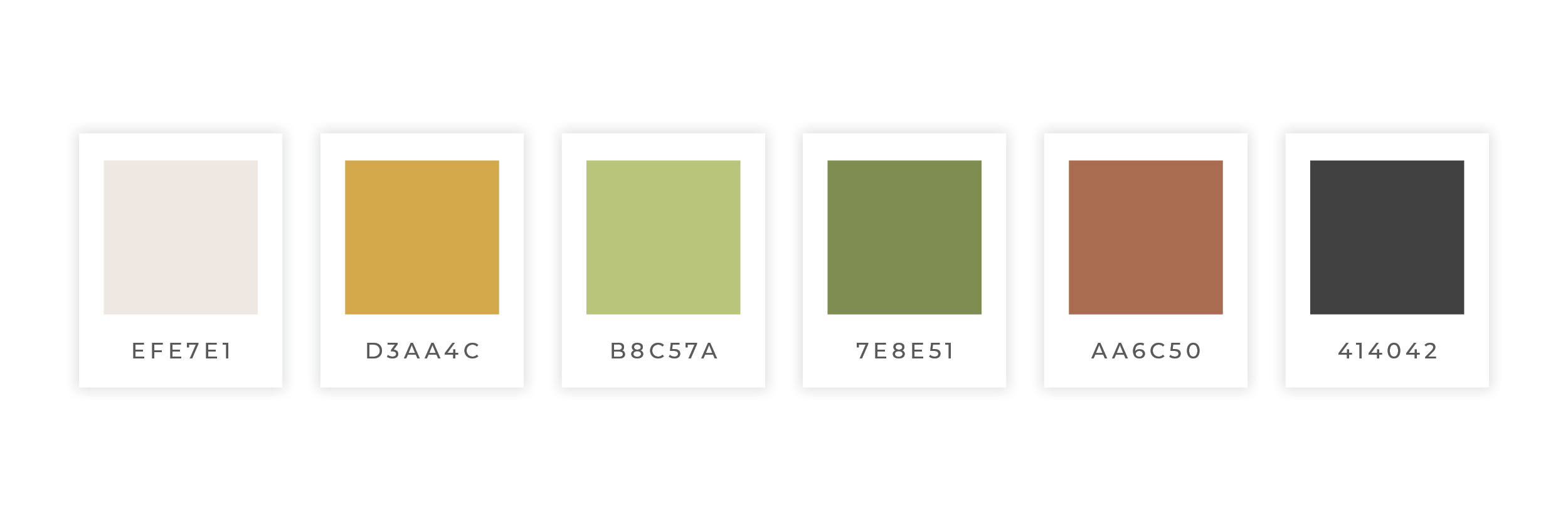
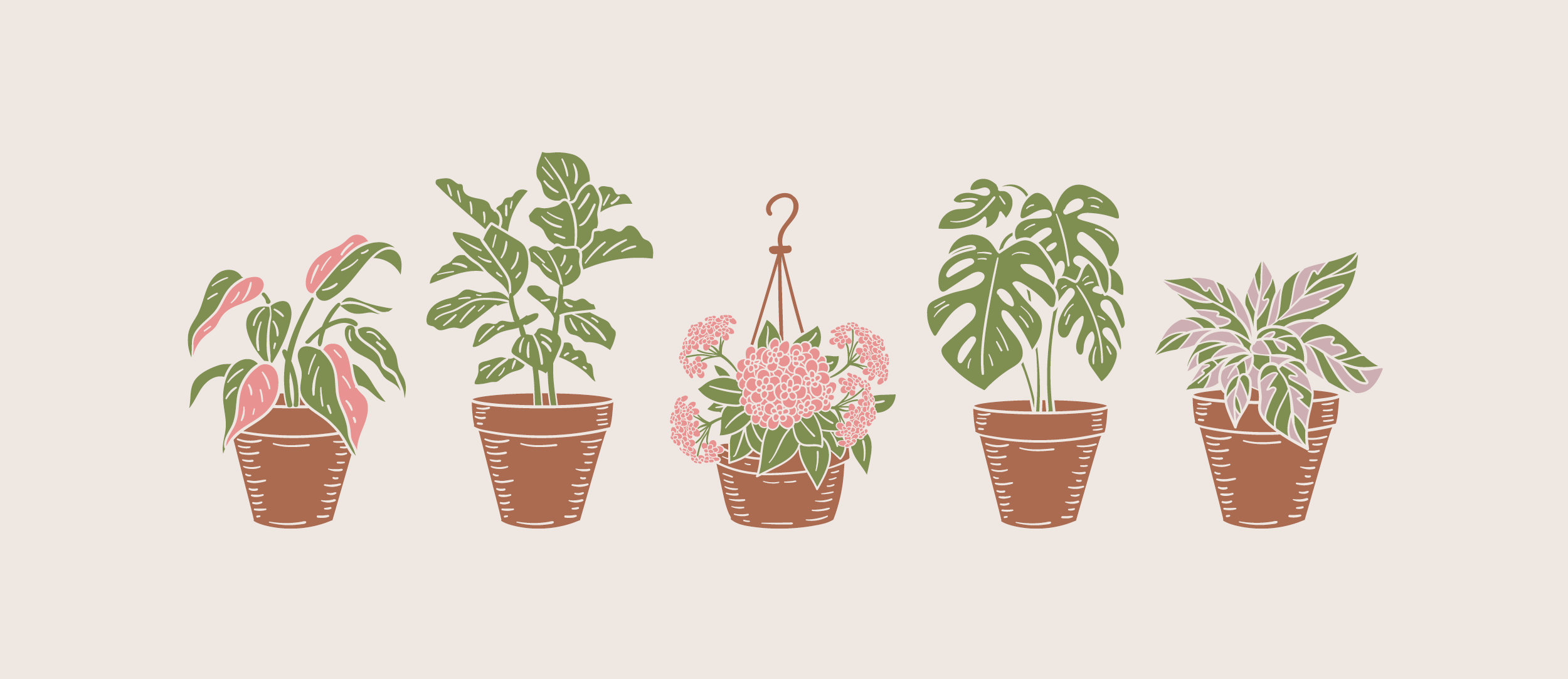
The color palette is expanded from the previous black, white, and green to include more earth tones and pops of brighter colors.
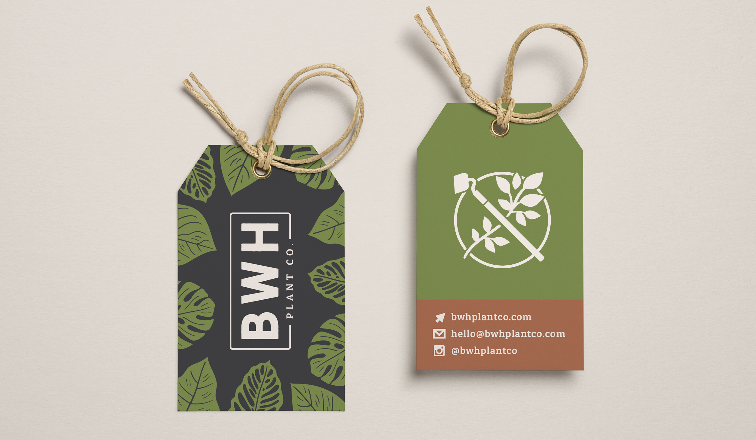
Hand-drawn supporting icons and brand illustrations complete the package - adding further versatility to the brand and reinforcing that sense of youthful energy and down to earth fun.
A plant nursery has never been this rad.
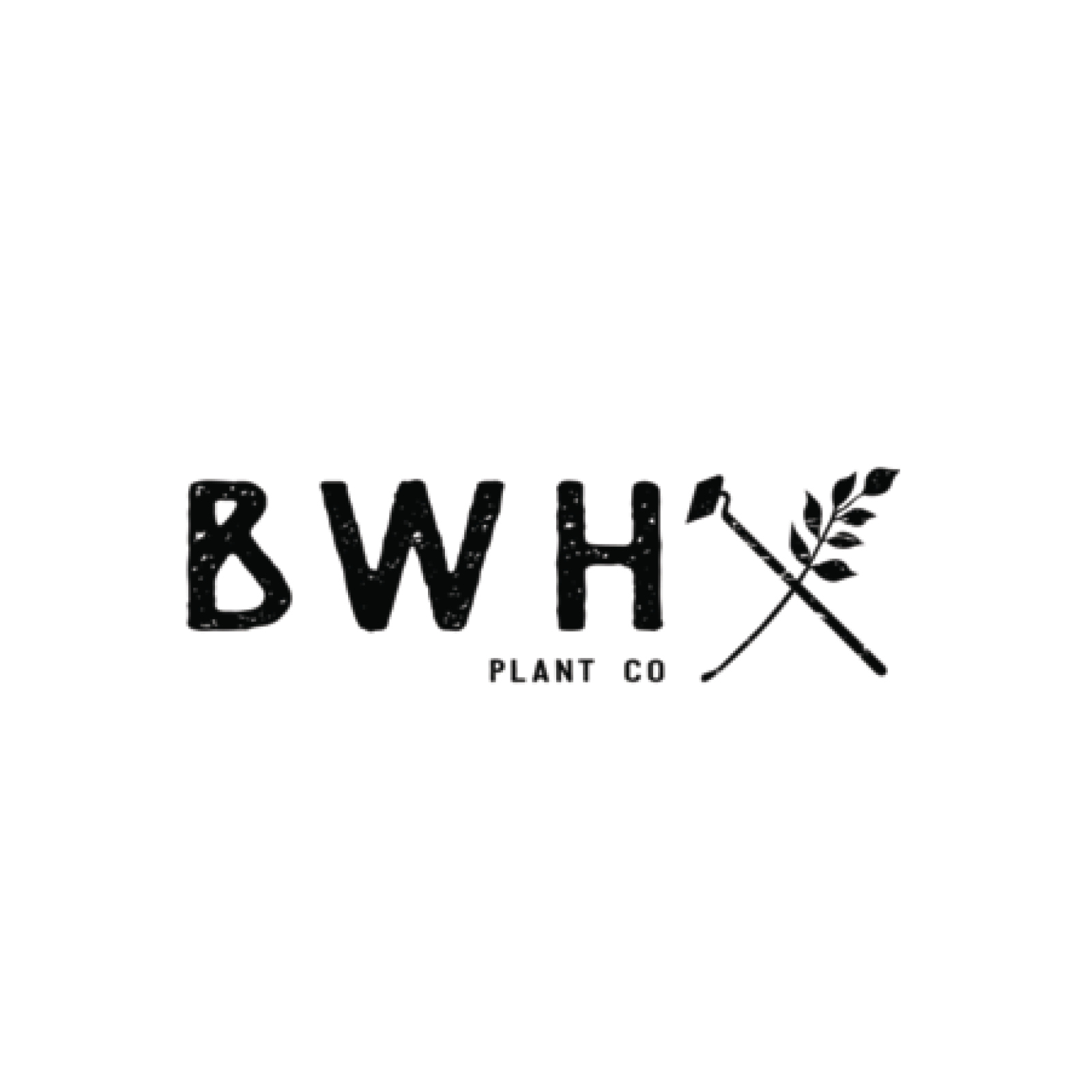
old branding

Updated Branding


Share this Post